Patrick Nagel Style
Share
Patrick Nagel Style
By Patrick Scullin
I first discovered Patrick Nagel like many kids of my generation, when I stole my older brother’s “Rio” album. I did that partly for the Duran Duran music but mainly because I fell in love with the beautiful and bold art on the cover. I had never seen anything else like it and it hooked me immediately. At the time I couldn’t explain what made it so captivating, but I recognized that it was something new and special. Of course, I wasn’t the only one to notice and I imagine that the Rio album is generally responsible for Nagel’s notoriety. Perhaps the album art made him famous, but familiarity alone doesn’t explain how his art became so consequential defining a generation of pop art. It is clear to me that part of what makes Patrick’s art stand out is the quality and craftsmanship of his design.
As an artist, I have studied and practiced a variety of styles over the years seeking to hone my own craft. I find myself returning to Patrick’s work, over and over again, as I look for inspiration. I am continually inspired by the way he eliminated unnecessary detail and focused on the essentials of line, shape, form and color. Line, shape, form and color are the fundamental elements of art and design. Lines define edges and create the contours that form the boundaries of shapes. Shapes are stacked, arranged and aligned to create the dimension and form of objects within a picture. Color is applied next to these forms giving life to the visual language of beauty.
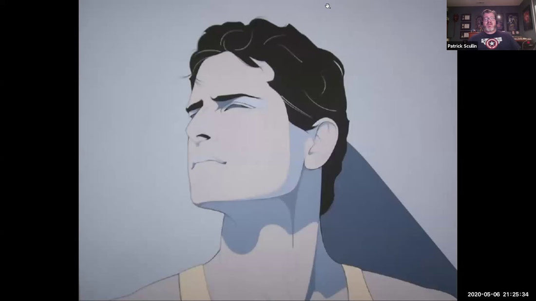
Pat’s art is written in the language of beauty. Through his art he achieved a perfect balance of line, shape, form and color when he captured the figure of a beautiful model. The “Nagel style” of sharp lines and sensuous curves celebrated the female form and defined a generation of glamour art and the bright colors he used set the tone for typical 80’s pop. The precision and quality of his art may lead one to assume that he used a computer to aide in his design, but he did not. Every line, every curve and every shape was made with a steady hand and deliberate intention.
Beautiful women are the common thread that connects Nagel’s art. He had the ability to capture their beauty in a unique and stylized way, but his art is more than just a “pin up.” Pat’s portraits display glamorous and elegant women that appear intelligent and confident in who they are. Like a classical sculpture they celebrate the female form giving the viewer something to venerate and admire.
Recently, I found a rare interview where Pat described some of his process. He talked about drawing and sketching. He said that for him sketching was the fun part and that all your problems are solved there. Sketching is my favorite part too. It is the point where my fleeting ideas become real and take form. Drawing engages the mind and the hand in a process I call visual thinking. The graphic designer in me also favors planning, measuring and composing an image so the drafting stage gives me the opportunity to make and correct mistakes. The contemporary art world sometimes discounts the value of drawing, and many designers skip the step entirely favoring the computer instead. This is a mistake. Drawing will always be fundamental to the artist and designer even if it means picking up a stylus and a tablet instead of pencil and paper.
Ironically, at the very time Nagel was perfecting his handmade craft, software was being written and new technology was being invented to make possible the explosion of computer graphics that would follow. Unfortunately, due to his untimely passing, he was never able to explore or experiment with the computer-generated possibilities that digital art could have given him. Still, his art set the stage for what was to come because his art inspired generations of digital artists that followed in his footsteps. In a way, Nagel should be considered the grandfather of vector art.
I feel lucky that my discovery of Patrick’s art and my training as an artist and designer coincided with developments in computer technology. This has aided my process in numerous ways making it possible for me to work both analog and digital. Art for me is a strange alchemy that combines traditional and digital mediums into a finished product. Modern artists and designers must be bilingual speaking both pencil and paper and bits and bytes.
Vector art is made by manipulating computer generated shapes and mathematically precise Bézier curves to form an image. Where Nagel would create a line using a pencil and a French curve, modern artists use the pen tool, paths, points and curve handlebars inside a computer program. The medium and the process are different, but the language is the same. Whether the artist uses a mouse or a pencil to manipulate the elements of art it does not matter. To speak the language of beauty one needs to learn the universal principles of symmetry, proportion, balance and contrast to understand the significance of what Nagel achieved.
Printing is another important aspect of Nagel’s work and why it became popular. Official and “unofficial” prints are what made it possible for Pat’s art to reach the masses. During his career he was able to partner with the Mirage Gallery and publish beautiful collectable posters. The poster is the perfect format for Pat’s work and the lines, shapes and colors he used were almost tailor made for the screen printing process.
As a professional screen printer I am also fascinated by the methods used to reproduce Pat’s original work. At the time, his posters were printed entirely by hand but today this is another example of traditional techniques being enhanced by a computer. Screen prints are made by breaking the art down into layers of flat color printed one at a time. The artwork is first prepared and separated in the computer generating the necessary film and screen printing frames. The frames are then manually registered, inked and used to print the posters by hand. Exceptional technical skill is on display both by the artist who creates the art and craftsman that prints the poster. This is what makes the poster a valuable work of art unto itself.
I admire every aspect of Patrick’s artwork. From his initial pencil sketch of a beautiful model all the way down to the hand printed poster. My own experience as a professional has taught me how to engage his work on fundamental levels and I am grateful for that understanding. My name is also Patrick, which makes me want to carry on the tradition and honor his legacy even more.
The genius of Pat’s art and the “Nagel Style” is that it is both simple and complex. It is mathematical and organic. It is handmade but to the modern eye, looks computer generated. This duality gives his art a universal, timeless and lasting appeal. In a word, this is what makes his art beautiful.